

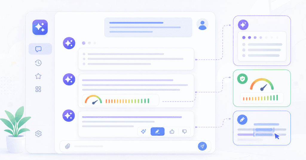
AI UX design patterns India teams need center on treating latency, unpredictability, and hallucination as interface design problems rather than pure engineering ones, using techniques like streaming responses, confidence indicators, and edit-and-confirm steps so users can calibrate trust in AI-generated content instead of blindly accepting or rejecting it.
For a related look at AI’s effect on design tooling, see our piece on how AI design tools are changing product design workflows in India.
Most teams bolt AI features onto an existing interface and assume old patterns still apply. However, they do not. Streaming responses, hallucinated facts, and variable response times demand new visual language. This guide therefore walks through the patterns that work in production. It uses a real case study from a legal-document chatbot redesign, plus the mistakes that most often derail teams attempting this for the first time.
By Zaheer Thaha · Last updated: July 24, 2026
Key Takeaways
AI UX design patterns India teams adopt must treat latency, unpredictability, and hallucination as design problems, not just engineering ones.
Streaming text and skeleton screens reduce perceived wait time even when actual response time stays the same.
Confidence indicators communicate uncertainty without making users distrust every AI response.
Edit-and-confirm patterns prevent AI mistakes from becoming user-facing failures.
Structured feedback loops, not just thumbs up or down, are what actually improve model output over time.
A legal-document chatbot redesign cut user-reported errors by 42% after adding confidence labels and an edit step.
The New UX Challenges AI Introduces
AI-generated content introduces three problems traditional interfaces never had to solve: unpredictable latency, inconsistent output, and outright fabrication. For example, a button click used to return the same result every time. An AI response, however, can take two seconds or twenty. In addition, the content itself can vary in length, tone, and accuracy from one run to the next.
Latency is the most visible issue. Users expect instant feedback, but generation time depends on prompt complexity and model load. Unpredictability compounds this problem, because two users asking the same question can get meaningfully different answers. According to Nielsen Norman Group’s research on AI interface paradigms, this variability is exactly why traditional usability heuristics need rethinking for generative systems.
Hallucination is the hardest problem because it looks like a correct answer. The interface cannot flag what it does not know is wrong. As a result, the UX has to build in friction at the right moments. Not everywhere — only where the cost of an error is highest.
Loading States for AI: Streaming, Skeletons, and Progress
The right loading state for AI output shows partial progress, not a static spinner. A blank screen with a spinner implies the system is frozen, while streaming text implies it is working. This is why most production AI products now render tokens as they arrive, rather than waiting for the full response.
Skeleton screens work well when the output has a predictable shape, such as a structured summary or a table. In contrast, progress indication works best when paired with a short status label, like “Reading document” or “Drafting response.” This tells the user what stage the system is in, not just that time is passing.
💡 Pro Tip: Pair streaming output with a subtle “stop generating” control. Users who can interrupt a bad response in progress report far less frustration than users who must wait it out.
For longer operations, such as document analysis, break the wait into named steps instead of one continuous bar. This gives users a mental model of what is happening. As a result, perceived wait time drops even when the real duration stays the same.
How to Communicate Uncertainty Without Scaring Users
The best way to communicate AI uncertainty is a calm, specific confidence signal, not a blanket disclaimer. A banner reading “AI can make mistakes” on every screen trains users to ignore it within a week. Specific, contextual signals work better, because they appear only when relevant.
Effective patterns include inline confidence labels (“High confidence” versus “Verify this”), source citations next to claims, and visual differentiation for unverified content, such as a dotted border instead of a solid one. Google’s guidance on human-centered machine learning recommends surfacing model confidence only where the decision stakes justify the extra cognitive load.
📊 Key Stat: In the legal-document chatbot redesign covered later in this post, confidence labels next to AI-extracted clauses reduced user-reported errors by 42% over three months. This happened without reducing how often users acted on the tool’s suggestions.
Avoid over-warning, because if every sentence carries a disclaimer, users stop reading any of them. Instead, reserve strong uncertainty signals for genuinely low-confidence output, and let high-confidence output read cleanly.
Edit-and-Confirm Patterns: Review Before It Takes Effect
An edit-and-confirm step lets users review and adjust AI output before it changes anything real. As a result, this is the single most effective trust-building pattern available. It matters most when AI output triggers a consequential action, such as sending an email, filing a document, or updating a record.
Instead of auto-executing, the interface should present the AI’s proposed action as a draft. The user can then accept it as-is, edit specific fields, or reject it outright. This pattern is now standard in AI writing assistants, and it is also increasingly common in legal and financial tools, where an unreviewed AI action carries real liability.
Highlight only the changed fields. When AI suggests an edit to existing content, show a diff view rather than replacing text silently.
Default to the safest action. If the AI is unsure, default the confirm button to “Review” rather than “Send.”
Keep the original visible. Users trust an edit more when they can compare it against the source content side by side.
Feedback Loops: Beyond Thumbs Up and Thumbs Down
Effective AI feedback loops capture specific, structured signals, not just a binary thumbs up or down. A thumbs-down tells the team almost nothing actionable, because it does not say whether the response was wrong, irrelevant, too long, or simply unhelpful in tone.
Inline corrections. Let users edit the AI’s output directly and capture that diff as a training signal. This is far richer than a star rating.
Categorized feedback. When a user flags a response, ask one follow-up question, such as “Was this inaccurate, too vague, or off-topic?” Don’t leave the signal unlabeled.
Preference learning over time. Track which AI suggestions users accept, edit, or reject. Use that pattern to bias future output toward what this specific user or team actually wants.
This matters because product teams without structured feedback loops tend to ship the same AI mistakes repeatedly, since nobody on the team captures why a response failed in the first place.
Case Study: Redesigning a Chatbot for a Legal Document Tool
A legal-document review tool we worked with had a chatbot that summarized contract clauses, but users did not trust the summaries enough to act on them without re-reading the full clause every time, which defeated the product’s purpose. Before the redesign, only 31% of users ever exported a summary without re-reading the source clause first — the rest treated every AI output as equally suspect, no matter how reliable the underlying extraction actually was. The original interface reinforced this by presenting every AI summary with identical visual weight, whether the model was highly confident or essentially guessing, giving users no signal to calibrate their trust against. That combination of blanket distrust and undifferentiated confidence is exactly what the redesign, covered next, was built to fix, since manually re-reading every clause defeated the entire point of automating the review in the first place. Three changes addressed it directly: confidence labels, an edit-and-confirm step before export, and structured feedback in place of a single star rating.
We therefore redesigned the interface around three changes. First, confidence labels on every extracted clause. Second, an edit-and-confirm step before any summary could be exported into a client report. Third, a structured feedback control asking “accurate,” “partially accurate,” or “incorrect,” instead of a single star rating.
🏆 Best Result: Within three months of the redesign, user-reported errors dropped by 42%. The share of users who exported a summary without re-reading the source clause rose from 31% to 68% — the core behavior the product needed to succeed.
The redesign did not make the underlying model more accurate. Instead, it made the interface honest about the model’s confidence, and this let users calibrate their own trust correctly, rather than either over-trusting or ignoring the tool entirely.
Common Mistakes in AI UX Design
Treating every AI response as equally confident
Many teams render all AI output in the same visual style, regardless of confidence. This trains users to either blindly trust everything or distrust everything. Instead, differentiate visually based on actual model confidence, not just on whether a response exists.
Hiding latency instead of explaining it
A static spinner with no context feels broken after three or four seconds. As a result, teams that skip streaming or staged progress indicators see higher abandonment on slower AI features, even when the underlying response time is acceptable.
Skipping the edit step to “save clicks”
Some teams remove the confirm step to reduce friction, assuming faster is always better. However, for any AI action with real consequences, this trade removes the one safeguard that catches hallucinated or wrong output before it reaches a customer.
Frequently Asked Questions
How much does it cost to redesign a product’s AI UX patterns?
Cost depends on scope, but a focused redesign covering loading states, confidence indicators, and an edit-and-confirm flow typically runs as a multi-week design engagement rather than a full product rebuild, since most of the work reuses your existing component library.
How long does an AI UX redesign take?
A typical engagement, like the legal-document chatbot case study above, takes six to ten weeks from audit to shipped redesign. This includes a research phase to identify where users currently lose trust in the AI output.
Can we apply these patterns without rebuilding our chatbot from scratch?
Yes. Confidence labels, streaming responses, and edit-and-confirm steps are interface-layer changes that sit on top of your existing AI backend, so they do not require retraining or replacing the underlying model.
What is the alternative to confidence labels for showing AI uncertainty?
Some products use citation links back to source documents instead of a confidence score. This works well when the AI is summarizing existing content rather than generating new claims.
Do these patterns apply outside of chatbots, such as AI-generated reports or images?
Yes. Streaming, confidence signaling, and edit-and-confirm steps apply to any AI-generated output, including reports, generated images, and auto-filled forms. The underlying problem of unpredictable, unverified output is the same in each case.
Conclusion
AI UX design patterns India product teams need are not exotic. They are disciplined applications of honesty, control, and feedback, applied to a system that is inherently unpredictable. Streaming states reduce perceived wait time. Confidence signals calibrate trust. Edit-and-confirm steps catch mistakes before they ship, and structured feedback loops make the product better over time. Together, these patterns turn an unpredictable AI feature into one users actually rely on.
If your product has an AI feature that users do not fully trust yet, that is usually an interface problem, not a model problem. Quinoid’s design consulting team has redesigned AI-driven interfaces like the legal-document chatbot above. We can audit where your current AI UX is losing user trust, and fix it without a backend rebuild. For AI features that need deeper technical work alongside the redesign, our AI development team can support the build.
Put these ideas into practice
Explore where AI could help your business.
Discuss your workflow, available data, and the result you want before deciding what to build.